SwiftUI - 视图布局和演示
HStack
将其子级排列成水平线的视图。
创建静态可滚动列表
HStack (alignment: .center, spacing: 20){
    Text("Hello")
    Divider()
    Text("World")
}
LazyHStack
将其子项排列成一条水平增长的线的视图,创建项目仅在需要时。
ScrollView(.horizontal) {
    LazyHStack(alignment: .center, spacing: 20) {
        ForEach(1...100, id: \.self) {
            Text("Column \($0)")
        }
    }
}
VStack
将其子级排列成一条垂直线的视图。
创建静态可滚动列表
HStack (alignment: .center, spacing: 20){
    Text("Hello")
    Divider()
    Text("World")
}
LazyVStack
将其子项排列成一条垂直排列的视图,创建项目仅在需要时。
ScrollView(.horizontal) {
    LazyHStack(alignment: .center, spacing: 20) {
        ForEach(1...100, id: \.self) {
            Text("Column \($0)")
        }
    }
}
ZStack
覆盖其子级的视图,使它们在两个轴上对齐。
ZStack {
    Text("Hello")
        .padding(10)
        .background(Color.red)
        .opacity(0.8)
    Text("World")
        .padding(20)
        .background(Color.red)
        .offset(x: 0, y: 40)
}
}
List
一个容器,显示排列在单个列中的数据行。
创建静态可滚动 列表
List {
    Text("Hello world")
    Text("Hello world")
    Text("Hello world")
}
混合排版
List {
    Text("Hello world")
    Image(systemName: "clock")
}
创建动态列表
let names = ["John", "Apple", "Seed"]
List(names) { name in
    Text(name)
}
添加 section
List {
    Section(header: Text("UIKit"), footer: Text("We will miss you")) {
        Text("UITableView")
    }

    Section(header: Text("SwiftUI"), footer: Text("A lot to learn")) {
        Text("List")
    }
}
要使其分组添加 .listStyle(GroupedListStyle())
List {
    Section(header: Text("UIKit"), footer: Text("We will miss you")) {
        Text("UITableView")
    }

    Section(header: Text("SwiftUI"), footer: Text("A lot to learn")) {
        Text("List")
    }
}.listStyle(GroupedListStyle())
要使其插入分组 (.insetGrouped),请添加 .listStyle(GroupedListStyle()) 并强制常规水平尺寸类 .environment(\.horizontalSizeClass, .regular)。
List {
    Section(header: Text("UIKit"), footer: Text("We will miss you")) {
        Text("UITableView")
    }

    Section(header: Text("SwiftUI"), footer: Text("A lot to learn")) {
        Text("List")
    }
}.listStyle(GroupedListStyle())
.environment(\.horizontalSizeClass, .regular)
在 iOS 13.2 的 SwiftUI 中添加了 Inset grouped
在 iOS 14 中,我们对此有专门的样式。
.listStyle(InsetGroupedListStyle())
ScrollView
滚动包装内容视图。
ScrollView {
    Image("foo")
    Text("Hello World")
}
ScrollView 是一个允许滚动其包含的视图的视图。
当我们有一个无法在设备屏幕中一屏显示完整的内容时,我们会使用此视图。
在本例中,我们使用 s 滚动视图来呈现一个长文本列表�。
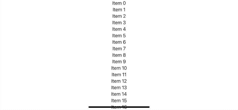 ScrollView 使内容可滚动。
如何使用 SwiftUI ScrollView
要使用 ScrollView,您需要放置一个 content 视图 您想要使其可滚动作为滚动视图内容。
struct ScrollViewDemo: View {
    var body: some View {
        ScrollView {
            VStack {
                ForEach(0..<100) { i in
                    Text("Item \(i)")
                }
            }.frame(maxWidth: .infinity)
        }

    }
}
ScrollView 滚动方向
默认情况下,ScrollView 使内容可在垂直轴上滚动。 您可以通过提供 Axis.Set 在初始化滚动视图时来覆盖它。
您有三个选项来设置支持滚动轴。
- 垂直:
ScrollView或ScrollView(.vertical) - 水平:
ScrollView(.horizontal) - Both 垂直和水平:
ScrollView([.horizontal, .vertical])
注意可滚动轴仅设置滚动视图的方向,而不是内容**。
在此示例中,我们将可滚动轴设置为 .horizontal,而 内容仍然在 VStack 中垂直渲染。
struct ScrollViewDemo: View {
    var body: some View {
        ScrollView(.horizontal) {
            VStack {
                ForEach(0..<100) { i in
                    Text("Item \(i)")
                }
            }.frame(maxWidth: .infinity)
        }

    }
}
此 ScrollView 只能水平滚动,但内容会垂直呈现并离开屏幕。
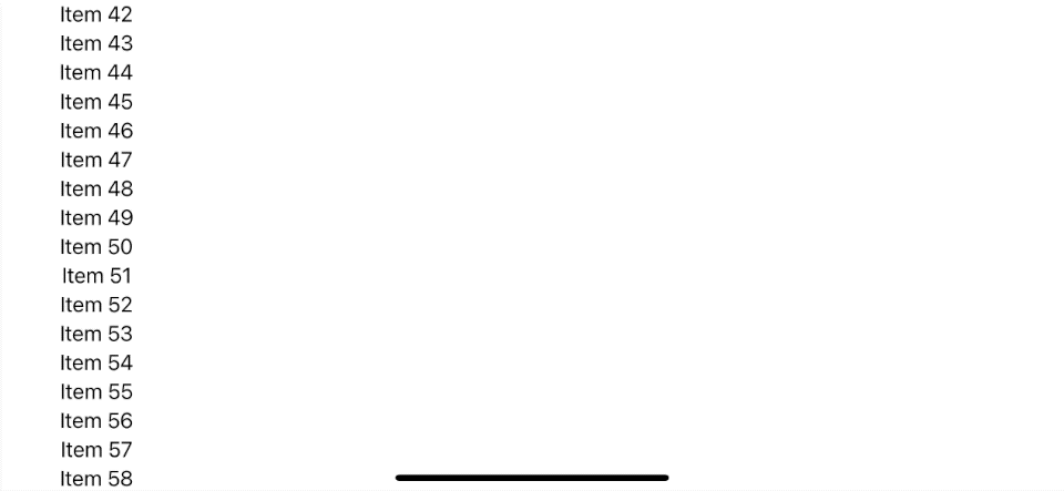 带有垂直内容的水平滚动。
如果您想水平滚动,您也需要更改内容的布局。
这是一个带有“HStack”内容的水平滚动视图示例。
struct ScrollViewDemo: View {
    var body: some View {
        ScrollView(.horizontal) {
            HStack {
                ForEach(0..<100) { i in
                    Text("Item \(i)")
                }
            }.frame(maxHeight: .infinity)
        }
    }
}
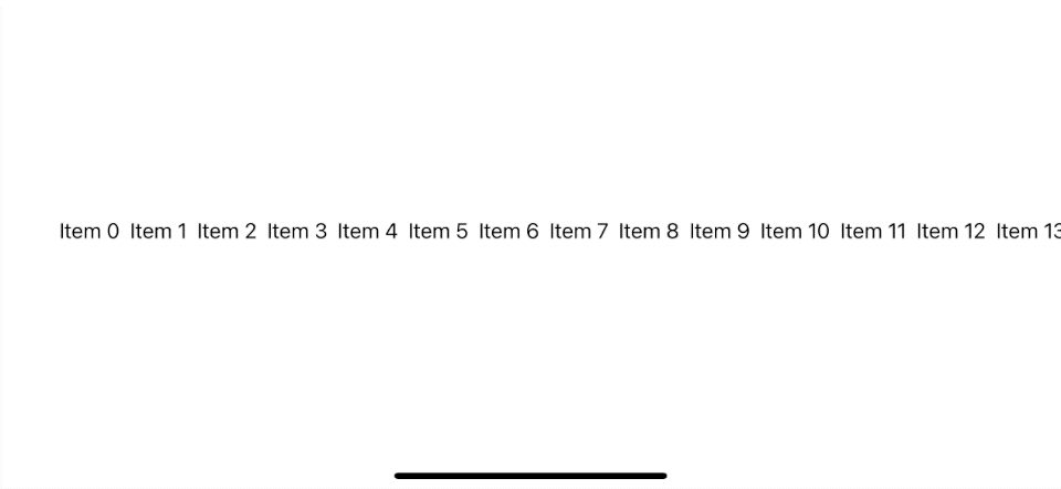 横向内容的横向滚动。
LazyHGrid
将其子视图排列在水平增长的网格中的容器视图,仅根据需要创建项目。
var rows: [GridItem] =
        Array(repeating: .init(.fixed(20)), count: 2)

ScrollView(.horizontal) {
    LazyHGrid(rows: rows, alignment: .top) {
        ForEach((0...100), id: \.self) {
            Text("\($0)").background(Color.pink)
        }
    }
}
LazyVGrid
将其子视图排列在垂直增长的网格中的容器视图,仅根据需要创建项目。
var columns: [GridItem] =
        Array(repeating: .init(.fixed(20)), count: 5)

ScrollView {
    LazyVGrid(columns: columns) {
        ForEach((0...100), id: \.self) {
            Text("\($0)").background(Color.pink)
        }
    }
}
Form
用于对用于数据输入的控件进行分组的容器,例如在设置或检查器中。
您可以将几乎任何东西放入这个 Form 中,它会呈现适合表单的样式。
NavigationView {
    Form {
        Section {
            Text("Plain Text")
            Stepper(value: $quantity, in: 0...10, label: { Text("Quantity") })
        }
        Section {
            DatePicker($date, label: { Text("Due Date") })
            Picker(selection: $selection, label:
                Text("Picker Name")
                , content: {
                    Text("Value 1").tag(0)
                    Text("Value 2").tag(1)
                    Text("Value 3").tag(2)
                    Text("Value 4").tag(3)
            })
        }
    }
}
Spacer
沿其包含堆栈布局�的主轴扩展的灵活空间,或如果不包含在堆栈中,则在两个轴上。
HStack {
    Image(systemName: "clock")
    Spacer()
    Text("Time")
}
Divider
可用于分隔其他内容的视觉元素。
HStack {
    Image(systemName: "clock")
    Divider()
    Text("Time")
}.fixedSize()
NavigationView
一个视图,用于显示表示导航中可见路径的视图堆栈层次结构。
NavigationView {
    List {
        Text("Hello World")
    }
    .navigationBarTitle(Text("Navigation Title")) // Default to large title style
}
旧式标题
NavigationView {
    List {
        Text("Hello World")
    }
    .navigationBarTitle(Text("Navigation Title"), displayMode: .inline)
}
添加UIBarButtonItem
NavigationView {
    List {
        Text("Hello World")
    }
    .navigationBarItems(trailing:
        Button(action: {
            // Add action
        }, label: {
            Text("Add")
        })
    )
    .navigationBarTitle(Text("Navigation Title"))
}
添加 show/push 和 导航链接
用于 UISplitViewController。
NavigationView {
    List {
        NavigationLink("Go to detail", destination: Text("New Detail"))
    }.navigationBarTitle("Master")
    Text("Placeholder for Detail")
}
您可以使用两个新的样式属性设置 NavigationView 的样式:stack 和 doubleColumn。 默认情况下��,iPhone 和 Apple TV 上的导航视图直观地反映导航堆栈,而在 iPad 和 Mac 上,拆分视图样式导航视图显示。
您可以使用 .navigationViewStyle 覆盖它。
NavigationView {
    MyMasterView()
    MyDetailView()
}
.navigationViewStyle(StackNavigationViewStyle())
在 iOS 14 中,UISplitViewController 新增了侧边栏样式。 你也可以通过在 NavigationView 下放置三个视图来做到这一点。
NavigationView {
    Text("Sidebar")
    Text("Primary")
    Text("Detail")
}
在toolbarItems中添加UIToolbar UIViewController。
NavigationView {
    Text("SwiftUI").padding()
        .toolbar {
            ToolbarItem(placement: .bottomBar) {
                Button {

                } label: {
                    Image(systemName: "archivebox")
                }
            }

            ToolbarItem(placement: .bottomBar) {
                Spacer()
            }

            ToolbarItem(placement: .bottomBar) {
                Button {

                } label: {
                    Image(systemName: "square.and.pencil")
                }
            }
        }
}
TabView
允许使用可交互用户在多个子视图之间切换的视图界面元素。
TabView {
    Text("First View")
        .font(.title)
        .tabItem({ Text("First") })
        .tag(0)
    Text("Second View")
        .font(.title)
        .tabItem({ Text("Second") })
        .tag(1)
}
图像和文本在一起。 您可以在此处使用 SF Symbol。
TabView {
    Text("First View")
        .font(.title)
        .tabItem({
            Image(systemName: "circle")
            Text("First")
        })
        .tag(0)
    Text("Second View")
        .font(.title)
        .tabItem(VStack {
            Image("second")
            Text("Second")
        })
        .tag(1)
}
或者你可以省略VStack
TabView {
    Text("First View")
        .font(.title)
        .tabItem({
            Image(systemName: "circle")
            Text("First")
        })
        .tag(0)
    Text("Second View")
        .font(.title)
        .tabItem({
            Image("second")
            Text("Second")
        })
        .tag(1)
}
UIPageViewController
UIPageViewController 成为 TabView 的一种样式。 使用页面查看样式,在标签上使用 .tabViewStyle(PageTabViewStyle()) 修饰符查看。
TabView {
    Text("1")
        .frame(maxWidth: .infinity, maxHeight: .infinity)
        .background(Color.pink)
    Text("2")
        .frame(maxWidth: .infinity, maxHeight: .infinity)
        .background(Color.red)
    Text("3")
        .frame(maxWidth: .infinity, maxHeight: .infinity)
        .background(Color.green)
    Text("4")
        .frame(maxWidth: .infinity, maxHeight: .infinity)
        .background(Color.blue)
}.tabViewStyle(PageTabViewStyle())
这个 PageTabViewStyle 将包含 UIPageindexDisplayMode 到 PageTabViewStyle。
.tabViewStyle(PageTabViewStyle(indexDisplayMode: .never))
页面控件有一种新样式,它将在页面周围呈现背景指标。 要强制执行这种新样式,请添加.indexViewStyle(PageIndexViewStyle(backgroundDisplayMode: .always))修饰符到您的选��项卡视图。
TabView {
    Text("1")
        .frame(maxWidth: .infinity, maxHeight: .infinity)
        .background(Color.pink)
    Text("2")
        .frame(maxWidth: .infinity, maxHeight: .infinity)
        .background(Color.red)
    Text("3")
        .frame(maxWidth: .infinity, maxHeight: .infinity)
        .background(Color.green)
    Text("4")
        .frame(maxWidth: .infinity, maxHeight: .infinity)
        .background(Color.blue)
}
.indexViewStyle(PageIndexViewStyle(backgroundDisplayMode: .always))
.tabViewStyle(PageTabViewStyle())
Alert
警告的容器。
我们可以根据布尔值显示Alert。
@State var isError: Bool = false

Button("Alert") {
    self.isError = true
}.alert(isPresented: $isError, content: {
    Alert(title: Text("Error"), message: Text("Error Reason"), dismissButton: .default(Text("OK")))
})
它也可以与 Identifiable 项绑定。
@State var error: AlertError?

var body: some View {
    Button("Alert Error") {
        self.error = AlertError(reason: "Reason")
    }.alert(item: $error, content: { error in
        alert(reason: error.reason)
    })
}

func alert(reason: String) -> Alert {
    Alert(title: Text("Error"),
            message: Text(reason),
            dismissButton: .default(Text("OK"))
    )
}

struct AlertError: Identifiable {
    var id: String {
        return reason
    }

    let reason: String
}
Modal
模态转换。
我们可以根据布尔值显示Modal。
@State var isModal: Bool = false

var modal: some View {
    Text("Modal")
}

Button("Modal") {
    self.isModal = true
}.sheet(isPresented: $isModal, content: {
    self.modal
})
它也可以与 Identifiable 项绑定。
@State var detail: ModalDetail?

var body: some View {
    Button("Modal") {
        self.detail = ModalDetail(body: "Detail")
    }.sheet(item: $detail, content: { detail in
        self.modal(detail: detail.body)
    })
}

func modal(detail: String) -> some View {
    Text(detail)
}

struct ModalDetail: Identifiable {
    var id: String {
        return body
    }

    let body: String
}
如果您想要完整呈现模态视图的旧式模态呈现屏幕,您可以使用 .fullScreenCover 代替 .sheet。
由于全屏封面样式不�允许用户使用手势来关闭 modal,您必须添加一种手动关闭呈现视图的方法。 在里面下面的例子,我们添加一个按钮来通过 set 关闭呈现的视图isModal 为假。
@State var isModal: Bool = false

var modal: some View {
Text("Modal")
      Button("Dismiss") {
        self.isModal = false
      }
}

Button("Fullscreen") {
    self.isModal = true
}.fullScreenCover(isPresented: $isFullscreen, content: {
      self.modal
    })
如果您使用自定义视图作为模式,您可以使用presentationMode 环境键。
struct Modal: View {
  @Environment(\.presentationMode) var presentationMode

  var body: some View {
    Text("Modal")
    Button("Dismiss Modal") {
      presentationMode.wrappedValue.dismiss()
    }
  }
}

struct ContentView: View {
    @State private var isModal = false

    var body: some View {
        Button("Fullscreen") {
            isModal = true
        }
        .fullScreenCover(isPresented: $isFullscreen, content: {
      Modal()
    })
}
ActionSheet
操作表演示的存储类型。
我们可以根据布尔值显示ActionSheet。
@State var isSheet: Bool = false

var actionSheet: ActionSheet {
    ActionSheet(title: Text("Action"),
                message: Text("Description"),
                buttons: [
                    .default(Text("OK"), action: {

                    }),
                    .destructive(Text("Delete"), action: {

                    })
                ]
    )
}

Button("Action Sheet") {
    self.isSheet = true
}.actionSheet(isPresented: $isSheet, content: {
    self.actionSheet
})
它也可以与 Identifiable 项绑定。
@State var sheetDetail: SheetDetail?

var body: some View {
    Button("Action Sheet") {
        self.sheetDetail = ModSheetDetail(body: "Detail")
    }.actionSheet(item: $sheetDetail, content: { detail in
        self.sheet(detail: detail.body)
    })
}

func sheet(detail: String) -> ActionSheet {
    ActionSheet(title: Text("Action"),
                message: Text(detail),
                buttons: [
                    .default(Text("OK"), action: {

                    }),
                    .destructive(Text("Delete"), action: {

                    })
                ]
    )
}

struct SheetDetail: Identifiable {
    var id: String {
        return body
    }

    let body: String
}